 A conversation at 5:30am this morning:
“Daddy, what is this letter?” (holding up a puzzle piece with a letter on it)
“It’s a letter ‘g'”.
“No, it’s not.”
“Yes, it is. It’s just a lowercase letter. A small one.”
“But where is the squiggle at the bottom?”
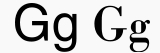
It turns out that she was talking about the loop at the bottom of the lowercase letter “g” that appeared in one of the books she has been learning words from. Looking up the letter G in Wikipedia did in fact bring up this interesting (to me) little bit of typography. If you look through the various letters, the lowercase “g” is really the only case I know of where we have common usage of a very different letter from a typographic point-of-view. (Well, another case might be the uppercase W.) Many if not most letters have common variations with and without a serif (the line on the top or bottom of a “stem” or main “stroke” of the letter, for those not accustomed to typographic terms). But I can’t really think of another letter that varies as much as the lowercase ‘g’. A quick survey of some of my daughter’s books shows that the g does have a “squiggle” or loop at the bottom of it in some common fonts.
From the Wikipedia article:
The modern minuscule (lower-case) G has two basic shapes: the “opentail G” and the “looptail G” . The opentail version derives from the majuscule (capital) form by raising the serif that distinguishes it from a C to the top of the loop, thereby closing the loop, and extending the vertical stroke downward and to the left. The looptail form developed similarly, except that some ornate forms then extended the tail back to the right, and to the left again, forming a loop. The initial extension to the left was absorbed into the upper loop. The looptail version became popular when printing switched to “Roman type” because the tail was effectively shorter, making it possible to put more lines on a page. In the looptail version, there is a tiny flick at the upper right which in typography is called its “ear”.
As I looked through our daughter’s books and also looked online, it seems that all the more recent books seem to use the “opentail G” without the loop/squiggle. The particular book where she pointed this out was an older Richard Scarry book (“Best Little Word Book Ever”) and the same font seems to be used throughout the “Golden Books” series of “classic” children’s books. It was also present, though, in other books.
On one level, it was an interesting discussion to have with my daughter (although we could have had it a bit later in the day, really) and an interesting pointer to me to notice the typography in books she is looking at… because she will notice it.
It was also interesting to think about how resources available to parents have changed as well. When confronted with the inevitable “I don’t know why it’s different”, I simply jumped online, went to a site (Wikipedia, in this case) and looked up the info. Fascinating world we live… and that’s the world my daughter and her peers will be growing up in!
Technorati Tags: typography
Yes, and the letter -g- is not the only one. You may notice that the lower case -a- also has two different designs. There is the type that you see here and then there is the type that your daughter prints out but also appears in some other typefaces.
I just came across this same issue while reading with my 4 year old “new reader” yesterday. We were reading a Random House Step into Reading book. They use a font (maybe Times or Garamond?) that presents the lowercase g with the squiggle. I was quite disappointed because it was distracting for a new reader. It was the only letter she did not recognize. It seems very unlikely that children across the U.S. would ever be taught the alphabet using material that presents the lowercase g with the squiggle because children are not only learning to read the alphabet, they are also learning to write the alphabet and humans do not write a single lowercase g in the shape of the Times or Garamond font. It seems to me that this is misstep particularly in the case of publishers of “early reading” books. Keep it simple. For the sake of a child’s learning.