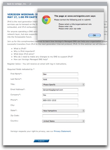
Anyone else see what is fundamentally broken with this form and the resulting validation error dialog box?

Don’t do this! Make it very clear to users exactly what information is and is not required.
UPDATE: (a few hours later) Verisign let me know via a tweet that they had fixed this … and would be more careful with their asterisks in the future 😉 Good to see that they were monitoring Twitter …
If you found this post interesting or useful, please consider either: