Category Archives: Tools

“It’s all content! It’s just story!… They want stories! They are dying for them.” – Kevin Spacey’s Brilliant Speech

Kevin spaceyDo you want to understand the future of television? of online video? of the future of creating video content? Actor Kevin Spacey really nails it in this speech at the Edinburgh International Television Festival.

If you have 45 minutes, the entire speech can be found on YouTube:
 

Some of the key points I enjoyed were around the 39-minute mark, but the whole piece is a brilliant look at where online video and television is at right now.

If you only have a few minutes, someone at the Telegraph in the UK made a 5-minute edited version that hits many of Spacey’s key points:

It truly is a great analysis of where we are today… and where the opportunities are…

I loved, too, that Spacey said something very close to what I wrote here back in January 2012 about the key to reducing piracy: give the people the content they want in the channel they want at a reasonable cost. It really is that simple.

I do hope that people in leadership positions within the media industry will watch / listen to this speech… if they want their businesses to survive and thrive in our new world, I believe many of the keys can be found here in this talk.

What do you think? Do you agree with Kevin Spacey?


If you found this post interesting or useful, please consider either:


Boom! Apple Disrupts Media Coverage of WWDC 2013 By Streaming The Keynote Live

Wwdc2013 live 300This morning I imagine there must have been a round of collective shock going through the tech media community as word spread that… GASP! … Apple is going to stream the WWDC Keynote today at 10am US Pacific LIVE on the Internet?

Apple?

Streaming a WWDC keynote… LIVE???

HUH?

Given Apple’s intense focus on secrecy, and the fact that the WWDC keynotes have NOT been streamed live in the past, an entire mini-industry has grown up around supplying “live” feeds out of the WWDC keynote. Sites like Engadget, Gizmodo, 9to5Mac, MacWorld and a zillion others have maintained “live blogs” posting the latest updates out of WWDC. These sites have been populated by reporters actually in the WWDC room using smartphones, laptops or whatever other tools they can. Photos were posted from phone cameras. Updates went out to social media.

In fact, past WWDC keynotes have been proving grounds for various forms of “live blogging” software and platforms – as many have collapsed under the crushing load of massive numbers of viewers wanting the latest news out of Apple. It’s also been interesting in the past to watch the different outlets and their strategies… having one person typing updates while another posts photos, for instance, while yet another is tweeting or updating other social media channels.

The scarcity of information led to truly creating a “spectacle”, as Apple is so good at doing. You had to visit these sites and watch the social media streams if you wanted to know in the moment what Apple was announcing.

It’s the way we’ve become used to monitoring WWDC keynotes within the tech community. We expected today’s speech to be more of the same. Each tech news site has been focused on providing the best and most comprehensive coverage of WWDC, knowing that doing so would garner them a large number of new visitors and potential subscribers. They were all gearing up for covering today’s event.

And then this morning… BOOM! … Apple just deflated and disrupted an entire way of covering the event.

Watch wwdc liveFirst word started circulating that Apple had rolled out an “Apple Events” icon on Apple TV allowing Apple TV owners to watch the stream live. Then a link appeared on Apple’s website where you can watch the WWDC lifestream. And then Apple actually issued a press release stating that they would be live streaming the event.

With one action, Apple just removed the primary need for all of those live blogs by all the major tech sites, as well as the need to follow streams on Twitter and other social networks. Sure, you can still follow them to get analysis or snarky commentary but there is no longer the need to follow them.

One site, 9to5Mac, has already stated they will be adjusting their coverage:

Update: Since Apple will be live streaming the event on the Web, iOS and AppleTV, we will be doing real-time updates only on our Twitter account and posting stories as they become available.

I expect some of the others will do so as well.

Now… will this actually lead to better coverage of the event for us as readers? In the past, these tech media sites have been competing with each other to churn out the live updates as fast as possible. But with the live stream available directly from Apple, will these news sites instead be able to focus on assembling articles about the announcements? (And will there then be even more articles churned out by the sites?)

It will be interesting to see… we’ll find out in about two hours… 🙂


P.S. This morning I published an audio commentary on this topic at:

I’ll note that at the time I recorded this podcast it was not yet known that Apple would be streaming the keynote live on their website.


If you found this post interesting or useful, please consider either:

WordPress 3.5 Nears Completion – First Release Candidate Now Available

WordpressLast week Andrew Nacin of the WordPress core team published an update titled “The short road To 3.5” that outlined exactly how close the team is to having a final release. The next day, in fact, the first “release candidate” of WordPress 3.5 was made available for download.

As noted in both posts, as well as the WordPress 3.5 schedule, the goal is to go through a couple more release candidates and then have the final release on December 5, 2012 – only 9 days away!

Whether or not the core team hits that goal will really depend upon how much testing they get (and they are looking for more people to test WP 3.5!) and what the status of the major issues are as the date draws closer.

For communicators/marketers, WordPress 3.5 continues the ongoing series of improvements to the WordPress “user experience” to make it even simpler and easier to use. I don’t know that anything in 3.5 necessarily rises to the “MUST HAVE IT NOW!” category, but certainly the improvements look good. I am particularly interested in the rewritten media subsystem that will apparently allow for much simpler insertion and handling of images. One thing that has always bothered me about WordPress’ media handling was the dialog boxes around setting a “Featured Image”. From the tickets, this seems to be one of many improvements.

New WordPress Multisite Goodness

Another feature I’m looking forward to for new installations is the ability to set up WordPress Multisite in “subdirectory” mode versus “subdomain” mode. To date, Multisite has only worked when you used a subdomain as the base for all blogs. For instance, you might base the blog at:

blogs.example.com

and then your individual blogs would be:

blogs.example.com/blog1
blogs.example.com/blog2
blogs.example.com/blog3
...

This works fine (and is still in 3.5), but if you want to integrate your blogs into an existing web site, you weren’t able to easily use Multisite. Now, with 3.5, you will be able to install WordPress Multisite into a subdomain, so that your base can be:

www.example.com/blogs/

and then your individual blogs can be:

www.example.com/blogs/blog1
www.example.com/blogs/blog2
www.example.com/blogs/blog3
...

This then allows you to continue using your main domain for SEO or branding purposes, but still have all the power of WordPress Multisite with regard to letting different groups have their own blogs with separate users, access control, etc. … and all the other goodness you get from Multisite.

Now, this option can only be chosen when installing WordPress Multisite, so it doesn’t help existing installations… but any new servers can be spun up in this mode if that works better.

The Normal Caveats Apply…

If you want to know more of the details of what will be in WordPress 3.5, the Beta 1 announcement had all sorts of good info. There’s also a ticket with a rough list of changes in 3.5. All of that info should eventually make its way to the Codex page on WordPress 3.5 as the release date nears. There are some really good changes for developers that ought to improve WordPress performance and help in so many other ways.

You should, of course, not just drop WordPress 3.5 onto your production site, even after it has been fully released. There are changes to the underlying systems and so you should really test it with your theme(s) and plugins to make sure that they all work before you make it live. You also of course want to backup your system and make sure that you have the ability to restore if you need to do so.

WordPress also has a “WordPress Beta Tester” plugin for the more adventurous who want to run a site testing out the newest releases. Again, I wouldn’t necessarily recommend this for production servers given that things will break during the normal course of development. Rather than use that plugin you can also just download the 3.5 release candidate and try it out.

I’m looking forward to seeing what this new release brings and to trying it out on my own systems. Kudos to the development team for their hard work and aggressive schedules!


If you found this post interesting or useful, please consider either:


Using iRecorder on the iPhone For Quick Podcasts – With WiFi Transfer

Ever needed to record a quick audio recording on your iPhone and then rapidly transfer it to a computer? There are many recording applications out there for the iPhone, but one I’ve found helpful is the aptly named “iRecorder”.

On Friday I read an email from Shel Holtz that he and Neville had to record this coming week’s FIR episode on Sunday morning and they needed our reports by then.

Knowing that today was going to be crazy and also knowing I had a number of tasks to do yesterday that kept me away from my office where my podcast rig is located, I whipped out my iPhone and used iRecorder to record my report. The interface itself is super-simple to use – just one button to push to start recording.

Irecorder

The reason why I like iRecorder, though, is that it has an extremely simple WiFi interface for transferring the recording. I just tap the down-arrow icon in the upper left corner and… ta da… it gives me a URL to hit in my browser:

Irecorder wifi

A quick trip to that URL in my browser shows me all the audio files I can download:

IRecorder browser

A click on the link and the audio file is down on my computer. Now all I did was bring the audio into Audacity, do a minor bit of trimming and then export it to MP3 to send to Shel and Neville.

Simple. Easy. Fast.

Now, I don’t feel the audio quality is as good as what I get on my podcasting rig, but that’s understandable… this was an iPhone being used as a field recorder. It was a bit too “hot” for me with some clipping going on. But it enabled me to get a report quickly together and submitted when I didn’t expect to have time to do so.

It’s a cool little tool… and you can find it in the iPhone AppStore.


If you found this post interesting or useful, please consider either:


Instagram Finally Becomes Useful With Web Profiles

FINALLY! Photo-sharing darling-of-the-media Instagram finally became useful to me with the rollout of web profiles where you (and everyone else) can see your photos. While I’ve had an Instagram account for some time, I haven’t really used it too much because there was no web interface and so you could only manipulate images via the mobile client. That’s fine for some usage… but it’s hard to go back and find older images… and extremely hard to share with people who did not have Instagram.

Now, web profiles are here and, even better, they are available at very easy URLs. Here’s mine:

http://instagram.com/danyork

The resulting page is laid out very nicely, with images changing periodically:

Danyork instagram 1

You can keep on scrolling down to see more and more of the images that you have posted. (And yes, it kind of looks like Facebook… which makes sense since they now own Instagram.)

This is a huge benefit to me because often I have found that I’ve wanted to go back and find an image I took in Instagram to use in a blog post – or just to show someone. Scrolling back in the mobile app is fine for recent images, but I haven’t found it fun if the image was some time back. This web profile page lets me easily scan back through all the images I’ve posted to Instagram.

Even better – and this is that part I find most useful – you can easily go to the individual page for a photo, such as this one:

Instagram single photo

Now I can see the image and easily share the URL for the image to people. As far as now using the image in a blog post, I didn’t yet find any way to embed an image, and I’m guessing that’s not there yet. But that’s okay, because I can just do a screenshot of my own image and use it in a blog post. The key is easily getting to see the image in a web browser.

Very cool to see… and as a result of this I expect I may indeed start using Instagram more!

How about you? What do you think of these new web profiles? Will you use Instagram more? (or perhaps even start using it?)


If you found this post interesting or useful, please consider either:


Brilliant Video – Every Presentation Ever: Communication FAIL

How many of the issues in this video have you experienced while in a presentation? Either one you have attended or perhaps one you have given yourself?

I learned of this today via a link in Facebook or Twitter (I can’t remember which) pointing me to a post from Mitch Joel back in January titled “How To Do Everything Wrong In A Presentation“. It is related to the book Habitudes for Communicators by Dr. Tim Elmore. I’ve not (yet) looked at this book but I’m definitely intrigued. In his post, Mitch also recommends three other books, one that I have (Presentation Zen) and two others that I’ve heard high praise about. All of these kind of books will only make you a better presenter… and I’ve added these to my queue of books to read.

Kudos to Dr. Elmore and his team for coming up with a funny and brilliant way to highlight so many of the issues we unfortunately do experience in presentations.

How many of these have you experienced?


If you found this post interesting or useful, please consider either:


Why I Will NOT Be Rushing To Upgrade To Evernote 5 For Mac

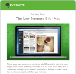
Evernote5formacThe team at Evernote is making a big push right now to let users know about the upcoming new Evernote 5 for Mac. They have even released a beta version for users to try.

I won’t be trying it. I’ll wait for others to take the chance.

Why not?

Primarily because…

Evernote completely burned me with their “upgrade” of Skitch!

This “redesigned” Skitch took away pretty much everything that I loved about the application. Now I realize that the Skitch development team is different from the developers behind the main Evernote app, but still…

they have lost my trust.

Further, I have been so burned in the past by other software companies that whenever I hear (as I do in the Evernote 5 video) the words “we’ve completely redesigned the application“, I immediately think:

NOOOOOO!!!! THEY ARE GOING TO TAKE AWAY ALL THE POWERFUL FEATURES I LIKE!

Evernote did it with Skitch. Skype did it with their Skype 5 for the Mac that left behind so much of the Skype 2.8 that we all loved. Apple’s done it too many different applications to count (ex. iMovie, Final Cut).

So I cringe whenever I hear the words “completely redesigned“!

Now, granted, I do appreciate it when companies take in user feedback and make new versions of their applications. I love it when companies are responsive and make applications better. I just don’t like it when they remove powerful functionality (even as I do understand that sometimes they need to do this to re-do the application).

For me, Evernote is a critical part of my daily workflow. I am a paying Evernote customer and use it across my multiple systems and mobile devices.

I don’t want that workflow screwed up!

So I will wait for a bit and see what others who are more daring than I say about the new version. I am pleased to see that the initial comments to the beta release post seem to be positive. I’ll continue to monitor the flow of comments for a while before I even think about upgrading.

What about you? Are you going to take the plunge?

FYI, here’s their video about Evernote 5:


If you found this post interesting or useful, please consider either:


Yet Another Skitch / Evernote FAIL – Image Sharing/Uploading No Longer Works

In the continuing saga of Evernote’s destruction of Skitch, a.k.a. how-to-really-badly-screw-up-a-product-loved-by-its-users, I grabbed a screenshot in the old Skitch 1.x (a.k.a. the version that works) and hit the “Share” button. I hoped to get back a skitch.com URL that I could then simply pop into Twitter to reply to someone.

Instead I got this:

Screen Shot 2012 11 01 at 5 30 41 PM

Skitch.com sharing has moved to Evernote.

Now, in fairness, they have been mentioning that this transition was going to occur for the past bit. So it’s not a tremendous surprise.

But here’s the FAIL – the “Click here” link takes you to a page on the “Skitch.com Transition to Evernote”. But this page simply tells you how to transition your old Skitch.com images to Evernote.

It tells me nothing about how to actually now share an image.

Zip. Na da.

I am left with the mockery of the first sentence: “Skitch is getting even better.

I am guessing that Skitch 1.x users who refuse to upgrade to Skitch 2.0 because it is an incredible downgrade in functionality are probably now just simply… screwed.

I am guessing the easy “Share” function that I use on pretty much a daily basis will now no longer work with Skitch 1.x.

I am guessing that I need to find a new screen capture program that does what I need.

(And yes, I’ve tried the new Skitch 2.0.1 but it still continues to add many more steps to the easy way Skitch 1.x worked and it still doesn’t do all that Skitch 1.x did.)

I am guessing all this because the link that Evernote/Skitch takes me to tells me nothing about how to actually share an image.

Further, I went to look in the Evernote forums to see what users might be saying there and… the site is down for me.

🙁


If you found this post interesting or useful, please consider either:


Evernote Destroys The Old Skitch With New 2.0 “Update”

This morning brings a collective “What the ______?” moment to the world of many Mac OS X users as we try to absorb the impact of the new Skitch 2.0 released by Evernote. Perhaps the reaction is best summarized by tweets like this:

Skitch2

[Screenshot of that tweet taken, by the way, with Skitch 1.0, immediately resized by dragging the corner, and dragged/dropped into MarsEdit where I’m writing this post.]

And articles are popping up on this same theme:

Evernote’s support forums are full of criticism and tweets are exploding with commentary.

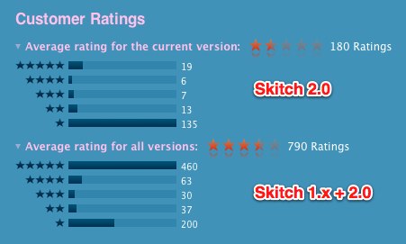
Perhaps more importantly for Evernote, existing users are well on the way to decimating the app’s ranking in the MacOS X AppStore:
Skitch ratings 1

Note the difference from before – and realize that those 200 one-star ratings at the bottom includes the 135 from above. So basically you are seeing a complete inversion of the app ranking going on right now.

There is somewhat of an irony to this as Skitch is getting heavy rotation right now as a “featured” app in the Mac AppStore.

A Very Happy – And Paying – Skitch v1.x User

I should preface these comments by saying that I have valued Skitch so much over the years that I have been a paid “Skitch Plus” user. I am also a paying user of Evernote. So this is not a rant of someone who expects something for free. I’ve paid for this software because it is so crucial to what I do.

Skitch is one of the applications that I use each and every day. Constantly. I take screenshots for blog posts and articles. I resize images and change their formats. I drop them into PowerPoint presentations. If I have a JPG and need a PNG, I drag an image into Skitch v1, change the format and drag it back out. If I want to crop an image, it’s a simple action. If I want to show someone remote something on my screen, I snap it and then copy/paste the URL into an IM or email message (or tech support web forum).

I use Skitch allthetime!

And over the years I have turned many people on to the tool… as have many others judging my the fact that there have now been over 10 million downloads. Skitch has been truly one of the absolute best tools for Mac OS X.

The “Paring Down”

The issue is that Evernote didn’t just “update” the application – they pretty much recreated the user interface. As they state in the blog post:

We pared the application down to it’s most-loved, most-used, most-essential features, then made those features as great as they could be. We also focused on creating a unified experience across all platforms. So, whether you’re using Skitch on your desktop or mobile phone, you’ll know exactly what to do.

The problem is that the list of “most-loved, most-used, most-essential” features apparently doesn’t include the ones that many of us use. 🙁

As an example, here are four features I use the most that are simply gone:

  1. Ability to rapidly resize images – In Skitch 1.0, all you did was go to the lower right corner of the window and start dragging it. Boom! Resized image. Super simple. Super FAST! Truly awesome.

    Now it’s hidden under Tools->Crop/Resize where you have to go through a dialog box to do the editing. Also, it seems I no longer can enter numerical values if I have an exact size I want to enter. (At least, I couldn’t find it.)

    So what was an instant task now becomes a series of dialog boxes and menu choices (or pressing “Option+Command+K” to get to the window).

  2. Ability to rapidly crop images – In Skitch 1.0, all you had to do was go to one of the sides or corners of the image and start dragging to crop an image. Super simple. Super FAST! Truly awesome.

    Now you have to go yet again into this Crop/Resize dialog box and go through the steps.

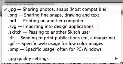
  3. Ability to rapidly change image types – In Skitch 1.0, there is this wonderful drop-down menu box that lets you choose the type of file you want to export:

    Skitch export

    With this one menu, you can export an image to whatever format you want. If I want a JPG, PNG, TIF or even a PDF. Just choose the type and drag away:
    Skitch export 2

    Super simple. Super FAST! Truly awesome.

    Now this, too, requires additional steps. You have to go to File->Export where you then go through the standard Mac OS X dialog box to save the file. The choices have also been dropped to PNG, JPEG, TIFF, GIF and BMP… although those were honestly the ones I pretty much always used.

  4. Ability to take a timed screenshot – In Skitch 1.0 there was this truly awesome capability where you could hold down the Shift key while taking a screen shot to get a countdown timer:

    Skitch timer

    This is tremendously helpful if you want to do a screenshot of a menu command, a pop-up or hovering menu, or just anything you want to re-create using the pointer.

    In Skitch v2.0 I can’t find this feature at all.

These are just four of the features that I commonly use that I have seen in the 2.0 version after I upgraded one of my systems. The forums are full of other features people used… the menu bar icon… custom hotkeys… the ability to share to your own SFTP server… the list goes on…

Destroying the Speed

Now, as I noted, with the exception of the timed screenshot these “features” are not truly “gone” from Skitch 2.0. They are just now buried in menus and take extra steps.

And that’s the point.

The most awesome part about Skitch was that it was insanely FAST.

In a few moments I could have screenshots that were resized, cropped, annotated and then dropped into articles or shared online. Simple. Fast.

And that’s gone.

Did We Ask For A Unified Experience?

Why would Evernote do this to Skitch?

I think the answer can be found in part of that blog post that I quoted earlier:

We also focused on creating a unified experience across all platforms. So, whether you’re using Skitch on your desktop or mobile phone, you’ll know exactly what to do.

And therein lies the problem.

I completely understand what they are trying to do – and on one level I applaud them for trying. Make it so that an app can work on the iPad and iPhone very much like the app on Mac OS X. Provide a common look-and-feel so that users can move between them easily. Even better, with Evernote syncing (more on that below) you can edit and use the same images across your different devices.

A very solid strategy that sounds great on so many levels. Consistent user experience. Consistent support requirements (ex. documentation, tech support, etc.)

It’s a perfect plan….. for a new application.

And for new users.

Anyone completely new to Skitch will probably try out the app and perhaps love it.

The problem is that to get to that “unified experience”, the Evernote/Skitch team had to pare down the Mac OS X app… to get it down to the least common denominator across all the various platforms.

And so we who had come to love Skitch on Mac OS X so much have to lose many of the features that were the reasons why we used Skitch in the first place… so that iPhone/iPad users can have a consistent user interface.

The Evernote Connection

One of the big features of this Skitch 2.0 release is that all your snaps are stored in Evernote. In fact, you can’t store them anywhere else… gone is the ability to (S)FTP images to another server. No more WebDAV… no more Flickr support… it’s all stored in Evernote. (Well, you can choose NOT to use Evernote and only store your images locally, but the only way to put the images up online where you can share them is through using Evernote.)

This makes sense from Evernote’s point-of-view and may very well be attractive to many users.

For me personally, though, there’s this basic issue:

I do not need (or want) to store my images!

The vast majority of time my usage of Skitch is to take a fast screenshot to drop into an article, blog post or presentation.

They are disposable images.

I don’t need to save them… or in fact I have saved them by using them in an article or presentation. But the image itself is no longer necessary.

So why do I want to clutter up my Evernote account with these unwanted images?

Now I guess that if I proceed with the upgrade I’ll have to plan some time to go in and occasionally delete out all the useless images.

I will admit that in some situations it would be helpful to be able to obtain the image from other systems… so I can see some value in the Evernote sync. But I still can’t think why I want all my images in Evernote.

What’s Next?

So now what?

I should note that Skitch 2.0 does bring some new features that are positive:

  • The new “pixelate” tool is something that I’ve wished Skitch would have for ages. It’s excellent to see! (Although I can’t seem to figure out how to undo/remove pixelation once it’s done. The standard “Undo” command doesn’t seem to remove it.)
  • The highligher tool is another excellent addition.
  • The way you can change the font size by dragging is nice.
  • The simple sharing to Twitter and Facebook is welcome.
  • As noted earlier, the Evernote sync (and search) may be welcome by some.

Will we as users come to appreciate those features as being useful enough to warrant all that is lost? Will the Evernote team come out with a 2.1 release that adds some of these features that we all are missing?

We’ve certainly seen other companies make similar moves. Apple did it with iMovie many years back and then recently with Final Cut Pro. Skype made a huge change with move from 2.8 to 5.x on the Mac. Twitter completely rewrote Tweetdeck. In all those cases a great amount of functionality was lost even while new features were added.

New users of Skitch may again find much to like in the new capabilities.

But what about the long-time users? Will they stick around to see if a newer version of Skitch 2.x comes out? Or, as I’m seeing in the Twitter stream, will people search for alternatives:

2 Twitter  Search  skitch  All Tweets

For me, I’m sticking with Skitch v1.x on my primary laptop where speed is essential. On another system I use less I’ve made a backup copy of Skitch 1.x but then have gone ahead and upgraded to Skitch 2.0. I’ll try it out and see if I can learn to like it (really not sure on that) – plus I can use the pixelate tool.

But… if some other tool does pop up that delivers the power and speed of the original Skitch, I could very easily see myself moving to that other tool.

This “upgrade” has completely burned any loyalty I had to Skitch… and I can no longer really recommend it as strongly as I once did.

It’s too bad. Skitch is a truly awesome tool that is an integral part of my daily workflow. It’s truly disappointing to see all that power and speed destroyed for the sake of trying to get to a unified cross-platform experience.

What about you? Are you disappointed in this new release? Or do you like the new Skitch 2.0? Are you going to stick with it? Or hunt for a new alternative?

P.S. All the images used in this post were touched by Skitch v1.x. The two tweets and the AppStore image were taken using Skitch, resized and dragged out of Skitch. The three images of Skitch itself were taken with the native Mac OS X screenshot keyboard shortcut that dropped an image on the desktop. I then dragged those screenshots from the desktop (individually) into Skitch where I then cropped, resized and annotated (in one case) the images before dragging them out to MarsEdit for this post. Super simple. Super fast. Truly awesome!


If you found this post interesting or useful, please consider either:


Google Now Lets You Handwrite Search Queries On iPad, iPhone, Android

Google handwritingOkay, I admittedly find this pretty cool… you can now enter search queries into Google on a tablet or mobile phone just by writing anywhere on the screen!

As Google’s blog post outlines, you need to go to www.google.com on your mobile device and then go into the Settings to configure this option. You do NOT need to sign in to Google. You just need to go there in your mobile web browser.

I’ve tested this on both my iPad and iPhone and found it worked quite well (per the blog post and Help Center page, it also works on Android phones and tablets – and is available in 27 languages). I find it particularly useful on the iPad where you have the larger screen to write on. On the iPhone, maybe my fingers are just too big but I found it tight to write in the regular portrait mode.

I did notice, though, that you can enter one or two letters, pause, then enter another letter or two… and as you do the search window is updated with what Google thinks the text should be as well as search query suggestions. So you may just be able to write a few letters and then tap the correct search suggestion.

Now, the question, of course, is WHY I find this interesting and the answer is that I have had some times when I’m in situations where it’s not super easy to type nor do I want to be talking to my phone (i.e. using Siri). With the iPad, in particular, there are times I’m holding it while walking around at an event where typing with two hands would not be easy and voice usage isn’t really possible. I could see this potentially being faster than hunt-and-peck typing a query using one hand. Will I use it all the time? No… but certainly I can see it being nice to have this option.

What’s also interesting about this feature is that it requires you to go to “www.google.com”. It doesn’t work with the “search” box that is in the top of Mobile Safari in iOS. You need to go to Google’s home page… so Google is pulling you out of using the app (Safari) and into using their web page. If you get used to doing that, Google can of course introduce other functionality – and if you are “signed in” you see your Google+ notifications and can easily access other Google services. Intriguing move by Google.

What do you think? Will you use this capability on your iPad, iPhone or Android device?

P.S. Alas, it is not as all-powerful as TechCrunch asserts with an ability to interpret cursive handwriting. I made several attempts at using cursive and found that in some cases the accuracy was “okay”, but clearly not as good as block printing. In fact, Google’s Tips for Handwrite very clearly state at the beginning that you should use block printing versus cursive.

And here is Google’s video on the topic:


If you found this post interesting or useful, please consider either: