Anyone see any issue with this web page? (click on the image to see a larger version)
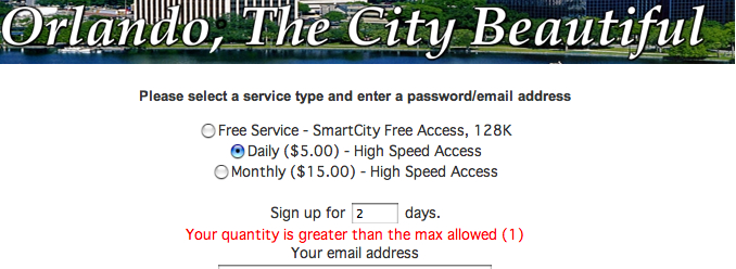
So if I don’t have a choice… if I can only sign up for 1 day, why give me the illusion of choice and require me to enter something in a useless field? Sheesh…
(And yes, I realize it is probably because this “SmartCity” software is deployed in many locations and in this particular location of Orlando, Florida, whoever is running it set the maximum allowed to one day. Still, you would think that someone could have made the software so that if “max = 1”, the user wasn’t given a choice. It’s just bad design in my opinion.)
Technorati Tags: web, userinterfaces