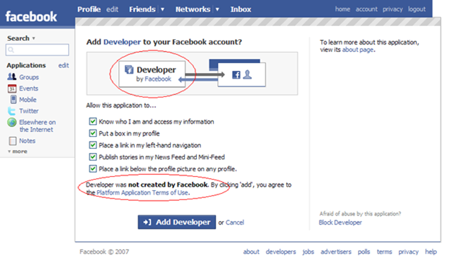
 Hint… I made it blindingly obvious with the red circles.
Oops.
Methinks they got a wee bit carried away with making their form templates generic!
Technorati tags: facebook
Hint… I made it blindingly obvious with the red circles.
Oops.
Methinks they got a wee bit carried away with making their form templates generic!
 As readers of this blog know, I built this blog (and the companion Disruptive Telephony) back in January by using the 3-column hack from TypePadHacks.org to essentially beat TypePad’s standard templates into submission and give me the format I’ve wanted. Overall, it’s worked well… except for the fact that when you leave a comment you get squeezed into a tiny central column. John Unger had a workaround for that which involved re-generating your Advanced Templates and copying/pasting a lot of things around… which is why I never quite did it.
So now comes word that TypePad has finally released a native template in this format! I’m delighted because I very much like the format and think it’s a great way to have a blog set up (obviously!). I look forward to using it on several of my other blogs. I am assuming it will also fix my issue of having a narrow comment field. It will also allow me to very easily manipulate sidebar content using the standard TypePad tools. I do it now through the Advanced Templates and, while it can be done, it’s not overly fun at times.
And… those users out there still stuck on Internet Explorer 6 will hopefully no longer have a problem viewing my blogs!
Unfortunately, it will probably be a bit for me to move these two blogs over to that new template. I’ve now customized and tweaked them so much in the Advanced Templates that it will probably take a while for me to get them moved over. (For instance, I have to move over the navigation bar that appears on the top.)
Still… I’m glad to see the format out there. And now if you are a TypePad user, you, too, can have a format like this blogs format… without all the pain! (The pain did, though, force me to learn an awful lot about TypePad Advanced Templates!)
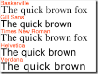 Listening to FIR #240 this morning, I learned that it is the 50th birthday of the Helvetica font. This actually struck me as a bit odd, as I personally thought the font was older than that, but no, it was created back in 1957 and is now owned by font giant Linotype. The BBC article starts out positively glowing about Helvetica and then introduces a bit of criticism… I’ll leave it to you to read it, but I did find this quote from typographer Neville Brody quite intriguing:
“Typefaces control the message. Choice of font dictates what you think about something before you even read the first word. Imagine Shakespeare in large capital drop shadow. Our response would be quite different towards the content.”
Exactly. Typefaces definitely do matter. And they definitely evoke passion… just look at the comments to the BBC article!
Personally, I can’t say I’ve ever been a “Helvetica enthusiast”. It’s a nice font, certainly, and I’ve used it in numerous documents (and continue to do so), but I don’t know that I really have any great passion about it. I do, though, recognize that it has had a tremendous influence within the computer industry as one of the dominant sans serif fonts in the electronic publishing space… and no doubt will continue to be used for quite some time. (And undoubtedly will continue to attract both supporters and detractors!)
Happy Birthday, Helvetica!
![]() Very early this morning, when I was awake but the rest of the household was not, I was reading an excellent book on a topic I’m very passionate about when all of a sudden I found myself drawn to a drop cap with the thought:
Very early this morning, when I was awake but the rest of the household was not, I was reading an excellent book on a topic I’m very passionate about when all of a sudden I found myself drawn to a drop cap with the thought:
Wow! What a beautiful “W”!
Like the image accompanying this blog post (which comes from the Wikipedia entry about “W”), the capital W that was the drop cap looked like two “V” letters with their lines crossed. There was actually a bit more separation in the two middle ascenders. The upper serifs had a break in them such that it really looked like an “X” with branches on either side. It was quite beautifully done.
So much so that I lost track of what I was reading and started hunting around for other “W” characters in other font sizes and locations (including the front cover). The uppercase ones all had the split serif while the lowercase one looked much more like a traditional “w” character. I went on from there to look at the other characters to see if there were any other exemplary characters. (There weren’t, although it was a nice typeface – no colophon to know what the precise typeface was, unfortunately.)
A few minutes later I returned to the text trying to remember where I was and what I had been reading.
While the distraction was really only for a few minutes and would probably be limited to an extreme few[1], it was a poignant reminder to me of the power that fonts/typefaces can have both to make our material beautiful… but also to distract from the message. And why it is so incredibly important to choose the typeface(s) you use so very carefully.
[1] Now, granted, odds are that in this particular case, probably very, very, VERY few people would have been distracted. It happens that I taught electronic publishing for about 5 years back in the 1990’s and still continue to have a fascination with many aspects of typography, so I have an interest in and appreciation for well-done typefaces.
 Yesterday Alec Saunders’ “Silverlight vs. Flash: the battle for the platform” was where I first learned that Microsoft was officially releasing “Silverlight“, the product previously known as “Windows Presentation Framework/Everywhere (WPF/E)” (and yes, I’ll agree that “Silverlight” rolls off the tongue a bit better than “WPF/E”…. (although not quite as easily as “Flash” but perhaps all the good one-syllable words have been taken)). The press release shows some pretty impressive support (but you would expect that) and it’s definitely great to see Microsoft also providing a version for Mac OSX as well as the other browsers of Firefox and Safari. To quote official materials:
Microsoft Silverlight will enable content providers to deliver media experiences and rich interactive applications that incorporate media, graphics, animation, and much, much more with full application functionality on both Windows and Mac platforms and inside IE, Firefox and Safari. Silverlight users will also enjoy compatibility with the broad ecosystem of Windows Media (VC-1) enabled tools and solutions, including existing and upcoming IIS and Windows Streaming Media server technologies.
Microsoft blogger Tim Sneath provides more details which definitely sound interesting…. I need to investigate XAML more personally, but I like a lot of what I read there. The ways in which video are to be supported are also intriguing to me. As hinted here and other places, there will be more announcements at Microsoft’s upcoming (and sold out) MIX conference April 30th. There has obviously been a ton of blogging about this since the announcement, but here are some links I found of interest:
With, as Alec says, Adobe Flash already installed on 84% of desktops, how good are Microsoft’s chances of success? Flash has been out there for many years now, has a very strong developer community and has a great number of tools to help in Flash creation.
Despite that, I have to say that Microsoft’s chances are probably quite strong, for several reasons:
To this last point, I would reference Tim Sneath’s followup post about feedback to the Silverlight announcement, where he talks about the fact that he’s left intact all the blog comments and addresses several points directly and ends with this:
Our success or failure with Silverlight is contingent on whether we satisfy developers like yourselves – time will tell how we do, but I hope that you’ll at least give us a chance to earn your trust.
Kudos to Tim for the openness and honesty and yes, they’ll have to earn our trust, but at least in the mind of this writer (who has a very strong Linux and open source background) they are certainly off to a good start. Let’s see what comes next…
P.S. And yes, Adobe also announced their Media Player to further increast the battle between the two companies.. but I’ll take a look at that separately in another post at some point. And yes, it would have been great if MS also announced a version of Silverlight for Linux desktops, too (which Adobe does have)… but, hey, I do give them credit for providing a Mac version and also supporting other browsers.
 In report today into For Immediate Release I raised the question of "What do you want to see in a corporate blog portal?" Either one for internal blogs on an Intranet, or one on a public site. I first posted this list back in February, but have refined it a bit since then… and this is where I’d like your help:
I would love to have your comments either posted here or sent in to FIR (fircomments@gmail.com) for the next show.
P.S. If you don’t understand the kind of site I’m talking about, take a look at http://blogs.sun.com/ or http://blogs.cisco.com/home as two examples.
DESIGN REQUIREMENTS FOR A CORPORATE BLOG PORTAL, version 2.0
The following is a list of requirements for a "blog portal" for a company or organization. This could be for either an internal or external (i.e. public) blog portal. I’ve broken this into two area: 1) the web interface that visitors see; and 2) the technology used by the software program implementing the blog portal.
User Interface Requirements
1. LIST OF AVAILABLE WEBLOGS – Ideally if you went to the blog portal you would first see a web page that listed all the various weblogs that are hosted on the website, complete with brief descriptions, links to their RSS feeds, etc.
2. AGGREGATION OF BLOG ENTRIES ON A MAIN PAGE – There should be a listing of "recent entries" across all blogs. This would allow someone unfamiliar with different blogs to simply look there and see what people are writing about. Two approaches I’ve seen work for this: a) raw aggregation of all recent entries across all blogs; or b) recent entry for each of the various blogs.
3. RSS FEED FOR ALL BLOGS – It would be great if the portal provided an RSS feed for this aggregation of blog entries. Think of it as the "everything" feed. There might not be many folks who would want this "entire" feed (outside of true company junkies, analysts, and competitive intelligence staff at competitors)
4. SEARCH ACROSS ALL BLOGS – On that same "main page" that lists all blogs on the platform, there should also be a Search box that allows you to search across all blogs for any entries in any weblogs that have the search words/phrase. Another search box (or the ability to use the same one with an option) for "tags" or "categories" would be a bonus.
Technology Requirements
5. DESIGN INTEGRATION WITH MAIN WEBSITE – It probably doesn’t need to be said, but a company is going to want to integrate this with the rest of their corporate website, so there needs to be the ability for the web design to be modified, customized, etc. to seamlessly fit in with the rest of the enterprise web site. So full ability to modify CSS, change headers, footers, graphics, etc., etc.
6. SUPPORT FOR USERS AUTHORING IN MULTIPLE BLOGS – Ideally a user should be able to login to the blogging platform and then contribute to whichever blogs they have been granted access. I don’t want to have to login separately for each of them – and from the admin side, it would be nice if there was an interface that made it easy for the admin to set permissions across blogs. (Step 1 could be requiring the admin to config ACLs on each blog, but ideally a Step 2 would centralize that into an interface that shows who can write where, etc.)
7. PRIVACY/PASSWORDS – There should also probably be the ability for a weblog author to "opt out" of the cross-blog search and appearance on the main page. Similarly, I could see the use in the ability to restrict access to *viewing* the weblog (and/or subscribing to its feed) to specific users. There could be a blog with content that is ideally only for executives, for instance. To me this is a lower priority because I think the greater value is in sharing information widely… private information can still be kept in email or on a specific hard drive. Still, I could see it being a request at some point.
8. STATISTICS – Everyone loves stats and at some point champions of a blogging project will be asked how it is going. Anything that can give overall stats, typical web stats like number of page views, etc., but also more blogging-specific things like total number of posts, average number of posts per day/week/month, total number of comments, average number of comments per day/week/month, avg number of comments per post, subscribers to RSS feed (which I grant is tough to discern), number of posts in last day/week/month, etc.. If the portal was for external blogs, you could get fancier and give stats on number of trackbacks, external links, etc. Overall summary stats would be great, but also stats for individual blogs. Ideally even a page that compared all hosted blogs in those stats. This would enable the champions of the blogging program to see which blogs might be doing exceptionally well, which might be struggling and indeed which have stopped – without having to visit all the individual blogs. Bonus if the software generates nice pretty charts that can be used as eye candy in powerpoint presentations.
Comments and feedback are definitely welcome!
Nice piece by Michael Seaton over at the Client Side Blog: “Presentations are Art“. As I’ve written here in the past, there’s definitely a need to move beyond presentations that are simply filled with bullets. I liked this part of his post:
I don’t know about you, but I have yet to recall anything from a presentation where words on slides were the prevailing feature. However, I fondly remember (in detail) great stories and storytellers. These are the folks that use images over words and engage with an honest and compelling approach to the subject at hand. The ones who manage to energize, motivate and educate in a way that is conducive to their cause and yours.
Well said… and I totally agree. There’s actually a much longer post on the subject rattling around inside my head, but for the moment, I’d direct you over to Michael’s post where he provides some tips about how to make your presentations better.
Nicely done, Michael.
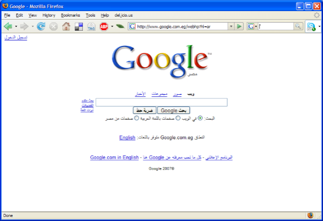
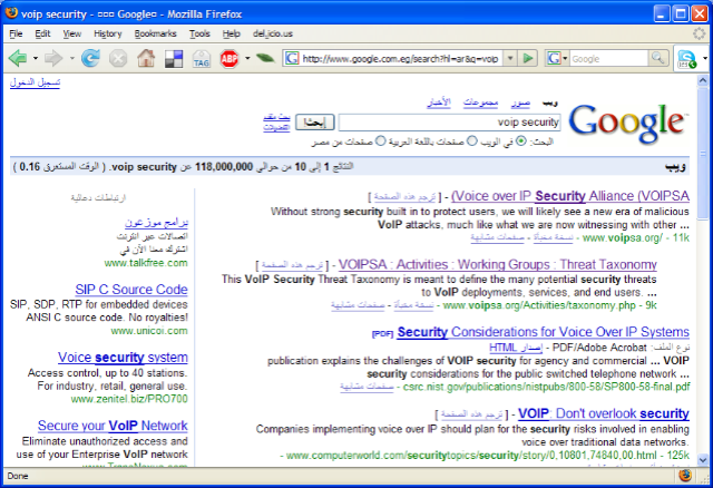 Logging onto the Internet here at the hotel in Cairo (for the glorious sum of $26 USD/day) had a rather amusing consequence – the main page for Google is entirely in Arabic! (click image for larger image) The text you enter in appears on the right side of the search box, and the results, as shown on the right (click image for larger image) appear on the right side as well. Google icon on the right… essentially everything the reverse of the way it appears on the English page (as is appropriate for the way it would be in the Arabic language).
Now, there’s a link there that allows you to easily get to the English search page… but I did have to say that this was definitely an entertaining side note of connecting to the Internet from an IP address range obviously known to be Egyptian! No, Toto, I’m very definitely not in Kansas anymore… 🙂
 It seems that missed somewhere in all the hoopla about Office 2007 is the fact that Clippy is dead. The pretty near universally-disliked Office Assistant is not included at all in the new release of Office… (details over at AppScout.)
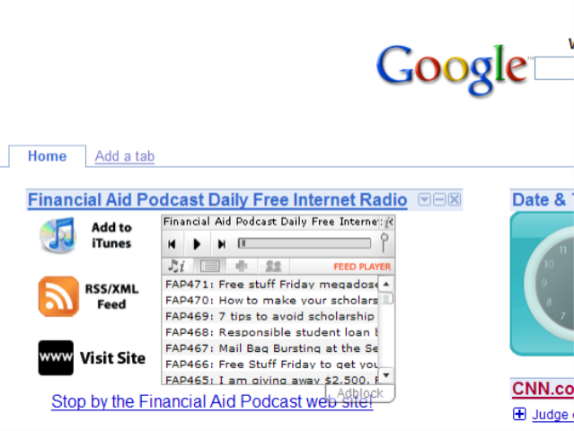 The ever-amazing Christopher Penn over at the Financial Aid Podcast has put out the word that next weekend at Podcamp Toronto he will be releasing the Google Gadget Widget Kit. I have to say that his example with his own podcast is very cool (picture on the right of it installed on my own Google Desktop). I’ll look forward to trying it out for Blue Box once he releases the kit. Chris indicates that it can be added to any web page, so I’ll be intrigued to play with it a bit more once it’s out.
Thanks, Chris, for sharing these tools… and for all the other little projects you are doing. 🙂