Category Archives: TypePad

Blogging from the iPhone to WordPress MU works – sort of

As you can see in this screen capture, I am using the WordPress iPhone app and it IS working to post to the Voxeo blog site that runs WordPress MU… However, as shown in that image, the app is confused about the names of the different WPMU blogs. It gave all four of them the same name, even though I went to different urls. I can though post to the different blogs. It is just a UI issue in the app. Maybe in the next version. Pretty cool, I have to say.


UPDATE (a few minutes after posting the text above): Now I posted this blog entry from the TypePad iPhone application, since this Disruptive Conversations blog runs on TypePad versus WordPress or WordPress MU. A couple of thoughts on that experience:

  • Using the TypePad iPhone app is clearly for just jotting a quick note and sending it up to your blog. Presumably I’ll get better at iPhone typing, but still, I can’t see me writing a length post.
  • More to the point, I didn’t see any way to either control formatting in the iPhone TypePad app. Now perhaps I can enter raw HTML… I didn’t try that, but I’m not really keen on that given the limited input capability on the iPhone.
  • Similarly, I saw no easy way to enter links… the links in the text above were added when I writing this text in MarsEdit and editing an already-published post.
  • I did not have any image formatting choices that I could see… I couldn’t align the image on the right (as I did here) or change the scale. The image was inserted at the top of the post with my text below it.
  • The TypePad iPhone app cropped my image to be square. Now, when I was adding the photo to my post in the app, I could “move and scale” the application, but there seemed to be no way to scale the screenshot down so that the whole screenshot would fit in the area. Everytime I scaled it down, it would pop back up to its full size (and maybe this is just because I’m an iPhone newbie).

Now those are issues with the TypePad app for the iPhone, but it looks like the WordPress app for the iPhone has similar issues. (Now maybe I need to learn more about what other options there are… perhaps I am missing some way to access other commands.)

Having said all this, it’s definitely very cool to have the option to post from either TypePad or WordPress to my various blog sites. I don’t see me using it too much when I have another option available… but I could see it being great for posting to the blogs while traveling.

What do you all think? Have you used either of these apps? Are there commands I’m missing?

Technorati Tags:
, , , , , ,

Where is the TypePad Mobile for *BlackBerry* users?

image Why doesn’t TypePad Mobile work with Blackberries?  As I was loading my new Blackberry with apps that I use, I thought to myself “Hmmm… doesn’t TypePad have an app for posting from your mobile device?”  Not that I’ll type long entries on it, given the keyboard size, but there are times when it would be great to dash off a quick entry from my mobile device.

Sure enough, they do… TypePad Mobile.  But it only works on:

  • Palm OS 5
  • Windows Mobile 5
  • Symbian Series 60

Um… excuse me, TypePad folks… if you are trying in general to cater to business users, aren’t you kind of forgetting a certain platform from that list?  Like, oh… the millions of business users of RIM’s Blackberries?

Now, granted, I can update TypePad via the web browser on the Blackberry, or email in a post (however, you can only set up email posts for a single TypePad blog and I write across several blogs that are under the same TypePad account), but it would be very nice if TypePad could make an app available for Blackberry users that made it easier to post from that platform.

Technorati tags: , , ,

TypePad *finally* provides a native "3-column layout" with 2 sidebars!

As readers of this blog know, I built this blog (and the companion Disruptive Telephony) back in January by using the 3-column hack from TypePadHacks.org to essentially beat TypePad’s standard templates into submission and give me the format I’ve wanted.  Overall, it’s worked well… except for the fact that when you leave a comment you get squeezed into a tiny central column.  John Unger had a workaround for that which involved re-generating your Advanced Templates and copying/pasting a lot of things around… which is why I never quite did it.

So now comes word that TypePad has finally released a native template in this format!  I’m delighted because I very much like the format and think it’s a great way to have a blog set up (obviously!).  I look forward to using it on several of my other blogs.  I am assuming it will also fix my issue of having a narrow comment field.  It will also allow me to very easily manipulate sidebar content using the standard TypePad tools.  I do it now through the Advanced Templates and, while it can be done, it’s not overly fun at times.

And… those users out there still stuck on Internet Explorer 6 will hopefully no longer have a problem viewing my blogs!

Unfortunately, it will probably be a bit for me to move these two blogs over to that new template.  I’ve now customized and tweaked them so much in the Advanced Templates that it will probably take a while for me to get them moved over. (For instance, I have to move over the navigation bar that appears on the top.)

Still… I’m glad to see the format out there.  And now if you are a TypePad user, you, too, can have a format like this blogs format… without all the pain!  (The pain did, though, force me to learn an awful lot about TypePad Advanced Templates!)

Subscribing to this blog via the browser RSS button now works… and an important TypePad/Feedburner lesson for me…

image I have to thank Wayne Smallman for clueing me in to a minor little detail that I’d overlooked back in January when I had first launched this blog.  Wayne, who I have met through a public chat room about Twitter and Skype, IM’d me (on Skype) to let me know that he wasn’t able to subscribe to the feed for this blog.

Given that this blog has been in action now for most of 6 months and I hadn’t heard this issue at all, I was very surprised.  Feedburner stats do show a good number of subscribers to the RSS feed… but I’m guessing that they (some of you!) must have all grabbed the feed URL from the big orange RSS button or used the “Add to Google” or “Add to Bloglines”, because the RSS icon in the browser address bar would definitely not work.

Here’s the deal… back when I was looking to split out my writing into multiple blogs last fall, I had another name for this blog and had set up a similarly-named feed in Feedburner.  Wanting to ensure that people got to my Feedburner feed, I went into the TypePad settings and “connected” my TypePad blog to the appropriate Feedburner feed.  Everything was good.  I was getting ready to launch.

But before I launched, I found that “disruptiveconversations.com” was available and since it went nicely with my already existing “disruptivetelephony.com” domain, I decided to rename the blog.  In fact, I changed the underlying TypePad URL… changed all the template names, mapped the domain… and I created a new Feedburner feed with the new name.  All looked good and the various subscribe buttons you see on the right side all worked.    I launched the blog and you all have now been reading it for the past 6 months.

There turned out to be just one minor little detail:

I never went back and updated the TypePad <-> Feedburner connection!

Oops!  Yes, indeed, in the TypePad configuration screens this blog was very happily connected to the old feed at Feedburner.  The problem is – I deleted that feed quite some time ago!

The fix was quite simple: I simply disconnected this blog from the old Feedburner feed and then connected it back to the new Feedburner feed.  Done in just a couple of minutes and I verified that it all works.

I’m just a wee bit embarrassed that I never noticed it and obviously didn’t test it.  I’m also a bit surprised that no one ever commented in all this time… are people not using that RSS icon in the browser address bar to subscribe to feeds?

So in any event, thanks to Wayne’s query the button should now work fine!  If you tried subscribing in the past and it didn’t work, please do try it out now.  And Wayne, if I ever do get over to the UK, I will have to look you up and buy you a drink! 🙂

Technorati tags: , , ,

Switching back to moderating comments – anyone else having problems with TypePad requiring multiple CAPTCHAs and previews?

FYI, effective right now I’m turning OFF the CAPTCHA requirement for posting comments and very unfortunately switching back to requiring comment moderation.  I just tried posting a comment to one of my own posts and found that TypePad kept requiring me to re-enter a CAPTCHA – endlessly.  I did it about 8 times before I just said “enough is enough” and went into the TypePad control panel and switched back to moderation.  I first heard of this issue when a comment was left on an earlier post last week and I’ve commented successfully since then… but this was the first time I’d seen the issue myself.  I’ll file a help request with TypePad to report the issue, but in the meantime thought I would raise the issue here.  (And now comments will get through, but of course won’t be published until I approve them tomorrow.)

Technorati tags:

Yikes! My new blog format doesn’t work with IE 6!

 A colleague called me this morning to tell me that he was only seeing half my text on this blog and that it was getting cut off by the right two columns.  I checked in both IE and Firefox on my own systems and, finding everything looking fine, asked if he had refreshed/reloaded.  He had, but the issue turned out to be… he’s still using IE6!  And, sure enough, when I found that IE6 was still on another PC at home and opened this site myself… yes, indeed, it was all cut off (as seen in the picture on the right).  IE6 loads the main column in first, and so you see the text going all the way across the page…. but then the two right columns overlay on top!  Cutting off the text below for the length of the sidebar columns.  As you scroll down the page, the sidebars eventually stop and you can see the text.

So… it looks like something funky is going on with IE6 and all the TypePad CSS and templates that I’m using to make this site (and Disruptive Telephony) have the look they do.  Now, granted, Microsoft is more or less forcing folks to move to IE7, but there still may be many pockets (like companies with non-IE7-compatible web apps) where they still have IE6.  So for them… these sites of mine aren’t working for those readers.

Well, I guess I’ll just have to try to find some time to muck around with the TypePad Advanced Templates again…

Technorati tags: , , ,

New hack to TypePad – putting a graphic on right side of the heading banner…

Extremely astute observers of this blog – who happen to be visiting the web page versus reading it via RSS – will notice that the banner at the top of the page changed a wee bit over the weekend.  Over at the right side there are now two “conversation balloons” a la comic strips.  (Refresh your browser if you don’t see them.)  This was part of the vision of my original “blog split-up” back in January.  Each of the blogs (well, currently only this one and Disruptive Telephony, but I’ve probably got another in the queue) has a unique color for the banner but I also wanted a unique graphic. 

However – and this was a key point – I wanted the blog width to be “fluid” and the text to expand to the size of the browser window.  This naturally ruled out any fixed-size banner images and I knew that I was going to have to use CSS or something like that.  The answer appeared the other week when I noticed what a web designer was doing to change the format of an internal blog we are developing.  The code was really exceedingly trivial:

<div style="float:right;"><img src="imagename" align=left alt="somealttext"></div>

Now I also added a “margin-top:2px;” into the style attribute to move the image down a little bit, and you could also turn the image into a link if you wanted to. 

So now the trick is simply to put this into the right place in your TypePad templates.  As I mentioned previously, I used a “menu bar hack” from TypePadHacks.org to get the menu bar you see across the top of the page.  Because of that, I’m already deep inside TypePad’s “Advanced Templates” and already have a customized “banner-header” template.  I just inserted this one line (filled in with names, of course) into that template, republished the site and… ta da… I’ve got a graphic on the right side of my banner.  Well, I also had to create the image as a transparent GIF, but that’s a minor detail.  You’ll see I also have this over on Disruptive Telephony, although I’m probably going to change the image because I’m not sure that the white phone as I have it there is overly compelling or useful.  Need something a bit larger and more interesting… although I’m not sure exactly what.  For the record, I found that the images that worked best were about 50 pixels high.  (Larger images forced the banner to be thicker, and that’s not what I want.)

At some point when I have the time, I’ll write it up for John Unger’s TypePadHacks website.  I’d like to write up a bit more info about how to get the “banner-header” template if you don’t already have it.  Anyway, if you play with it, have fun…

Technorati tags: , , , ,

TypePad Hacks gives me "Applied Hacking Award" for blog redesign…

Last week, John Unger over at TypePadHacks.org dropped me a note to let me know that I was given an “AHA” award for my blog redesign.  It actually mentions “Disruptive Telephony“, but I’ll note the award here since this blog shares the same design and I write about blogging here.  He notes my use of the three-column hack and also the menu bar hack.  I do definitely appreciate the notice and feedback, so thanks, John, but I’ll really say thanks back to John and all the other members of the TypePad Hacks community who have put together the various “hacks”.  The site does make it very easy for someone to learn how to tweak their blog in different ways.  I’ve learned a good bit from the site and have more ideas for things I’ll do to these blogs once I can find some more of that mythical thing called free time…

P.S. Also check out the “landing page” of the other award winner, David Alexander. It’s nicely done and something I’ve been thinking about doing with another page (Hint… you’ll notice that I’m missing an “About” link here.  Stay tuned…)

Exploring Microsoft Windows Live Writer, part 1: Initial impressions

As I have started the transition from a single blog to a mini-network of blogs, I have had to find a new offline editor.  The editor I’ve been using for most of the past three years of blogging, Semagic, is a fantastic offline editor for LiveJournal and is one of the reasons for my often prolific posting there, it makes it just darn simple and fast to post.  It’s also really one of the main reasons I stayed over at LJ. Just made it too easy to blog fast! However, as I explored using it with TypePad, I found it had an issue with multiple accounts using the same user name.  I use the same user name (but different passwords) with both LJ and TypePad, but because of this, I couldn’t switch quickly between LJ and TypePad. So I decided to keep using Semagic for LJ posting and find another editor for working in multiple weblogs here at TypePad. I checked out ecto, and was quite pleased with it.  I set up templates and was getting all ready to buy it, but then I discovered that it would not handle my Blue Box postings very well, and in fact when I tried to switch to HTML view on a Blue Box posting, it would lock up ecto and jack my CPU. Probably something related to the Libsyn Flash player or some other object.  And while I could (and should) report the issue to the ecto developer and see if it could be fixed, I want to get blogging… now!  So in the meantime I decided I should give Microsoft Windows Live Writer a try, even though I’d heard decidedly mixed reviews from other bloggers.

So I have to say after using WLW for several days: I am impressed!

Here are some initial impressions – I intend to blog about this in probably a series of posts as I use it more and kick the tires a bit more.

POSITIVE POINTS

1. Easy switch from WYSIWIG to HTML – I’m an old-school HTML guy.  I started creating web pages back in 1992/1993 when all you did was hand-code them all in vi. And as much as I enjoy and use WYSIWIG editors, I want to be able to quickly switch between a WYSIWIG and HTML view. Sometimes I want to just tweak the HTML… or insert some HTML that isn’t fully supported by the editor.. or I want to resolve a problem that the editor won’t let me fix. WLW makes this trivial: "Shift+F11" flips you to HTML, "Ctrl+F11" flips you back to WYSIWIG. Hit plain old "F11" and you’re in "web layout" mode. Hit F12 and you see one of the best preview screens I’ve seen in any offline editor, period.  This switching is truly a thing of beauty.

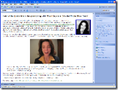
2. Embedding images – If you want to accompany a post with a graphic, like I did above with the screenshot, the process can be cumbersome: a) take screenshot; b) save it to a file; c) upload it to your server; d) link to it in your blog post. Offline clients should make this easy.  Semagic certainly did… you were prompted to save the files, but otherwise it handled all the upload and everything else for you.  WLW takes this a couple steps further: you aren’t asked to save it as a file, and the images are auto-thumbnailed. Clicking on the link gives you the larger image.  It’s a nice implementation.

3. Easy creation of links on text – Semagic has this one magic keystroke "Ctrl+Alt+L" that is a almost irreplaceable keystroke for the time-challenged blogger.  Simply highlight a URL in your browser, copy it, switch to Semagic, highlight the text and press Ctrl+Alt+L… ta da… you text is wrapped in the appropriate <a> tag linking to the URL you just copied.  Simple, easy, and allows for very rapid blogging.  This one feature alone has stopped me from using other offline editors (and was one issue I had with ecto).  WLW almost delivers this… and the way to do it is something I can live with.  You highlight the text and press "Ctrl+K" to get the link dialog box where the Link URL box is highlighted.  Press "Ctrl+V" to paste and press Enter.  So you can do it fast with "Ctrl+K Ctrl+V Enter". (As a bonus "^K^V" can take those of us WordStar users on a trip down memory lane.)

4. Easy switching between weblogs – So far, this has been very simple to do once each weblog account is set up in WLW.

5. Plugin gallery and architecture – It’s quite interesting to see that WLW has its own Plugin Gallery with all sorts of ways to extend the functionality (similar to what Firefox and Thunderbird allow).  For instance, the "Text Template" plugin so far seems to be the way to automate inclusion of HTML snippets into posts. (Such as images that are associated with certain kinds of postings, etc.)

NEGATIVE POINTS

1. Lack of keyboard macros? – One of the things Semagic let me do was associate any keystroke combination with a "macro", which is essentially an HTML snippet.  So, for instance, if I wanted to start a post about Blue Box, I simply went into Semagic, typed "Ctrl+Shift+B" and, ta da, the BlueBox log was there all wrapped in appropriate <a> and <img> tags.  These macros allowed again for very fast creation of a post.  In WLW, the previously mentioned "Text Template" plugin gets me close.  I just have to click on "Insert Text Template…" on the sidebar and then double-click on the template to insert.  It has some nice categorization capabilities that I could see being useful if I had lots of templates.  But I had to click on a link.  I don’t want my hands to have to leave the keyboard.  I want to pop open a window and start typing with keyboard shortcuts letting me drop in text, images, whatever.  Now, maybe I just have found this in WLW yet – or maybe it’s another plugin.

2. No option to keep the window open but clear the text after posting – This was a curious thing to get used to.  When you click on the Publish button in WLW, the post gets published, and then it is still there in your window.  Semagic’s behavior was that once you hit "Post", the post was published and then your window was clear so that you could begin your next post. If you wanted to get back to the old post, there is a menu option to edit your last entry.  WLW leaves you instead with the now-posted entry still there in the WLW window.  Now, I’ve already found that this can be positive because when I realized that I had an error in the just-posted post, I could quickly change it and re-post.  However, most times, I just want the post to be published and I want to start a new post.  I can of course hit the "New" button, but this then gives me a new window – and I’ve already got too many windows floating around!  There is an option in Tools->Preferences to "Close window after publishing", but that then closes out your window… and if you close all WLW windows, you have to relaunch WLW from the Start menu or QuickLaunch bar to be able to blog again.  What I would like is the option to simply erase all the text after the blog entry has been posted.  (And maybe I’ve missed the option…)


So those are my initial impressions… if any of you have used it and have comments, I’d certainly be interested in hearing that as well.  Stay tuned for more posts as I push it through my normal blogging.
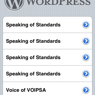
CSS , navbars and browser compatibility (aka why does it look so bad in MSIE 7?)

Odds are, if you are looking at this page today in Firefox, you’re seeing a nice little horizontal navigation bar at the top of the page underneath the banner.  If you are looking at this page today in IE7… well… you are probably wondering what navigation bar I am talking about!

You see… I’m experimenting with a navigation bar at the top of the page just underneath the banner so that as I move from a single blog into a network of topic-specific blogs, I’d like readers (and myself) to be able to easily move between them.  Armed with the excellent tutorial over on Typepadhacks.org, I’ve been experimenting with TypePad’s advanced templates.  If you look over at the top of Disruptive Telephony, you’ll see that I’m using the “Overlapping horizontal tabs” style found at the excellent DynamicDrive CSS Library.  It’s all done with Cascading Style Sheets (CSS) and a few little images.  Pretty fun stuff.

However, I thought that I’d try another style as well to see how it works.  So I tried the “Shade Image” style for comparison.  The result, in Firefox, is quite nice (click for a larger image):

However, if you take a look at it in Internet Explorer (I’ve now tried either IE6 or IE7), you get this:

Not exactly what we’re looking for!  Now, the “overlapping horizontal tabs” menu looks okay in IE, although the horizontal line annoyingly doesn’t line up with the bottom of the tabs, so that may be the one I use for the other blogs – or I may try some of the other styles.

I do like the “Slanted Divider” menu and the “Chrome” menu bar isn’t bad either, but neither of those shows you visibly which blog you are on.  That’s what I liked about these other two – it was very easy to see which menu choice you are on.

Just too bad that the CSS for that menu bar works so nicely in Firefox looks so poor in MSIE!